More On Result Charts: Beyer Figures, Time, and Extended Comments
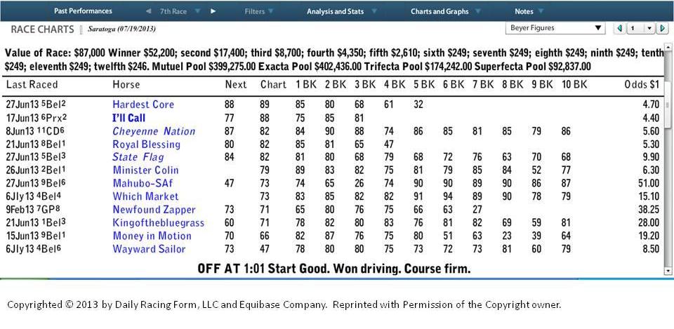
Continuing with the example from a prior article, “There’s Gold In Them Thar Result Charts,” we are going to review the additional information that can be gleaned from these detailed charts. Click here for a review of that article. We looked at a standard result chart and the “Next Race” version that shows you the very next race for all of the horses following the race chart being viewed. That allows you to see exactly how well each horse did after the race. But, how were they doing before, or leading up to the race being reviewed? For that, there is an option to view the “Beyer Figures” (Click here to learn about the fundamentals of Beyer Figures) for up to ten preceding races. The following result chart view was generated from the same July 19 race as in the prior article:
If the chart is hard to read, click on the image and a larger version will appear. This view shows a matrix of Beyer Figures for each horse, from most recent on the left to oldest on the far right. It allows you to quickly visualize how “fast” the competition had been leading up to the race in the result chart, which is the 2nd column from the left. From here you can see if the horse you are reviewing had a reasonable shot against the field, was over-matched, or maybe was superior to the other horses running. All useful pieces of information when handicapping.
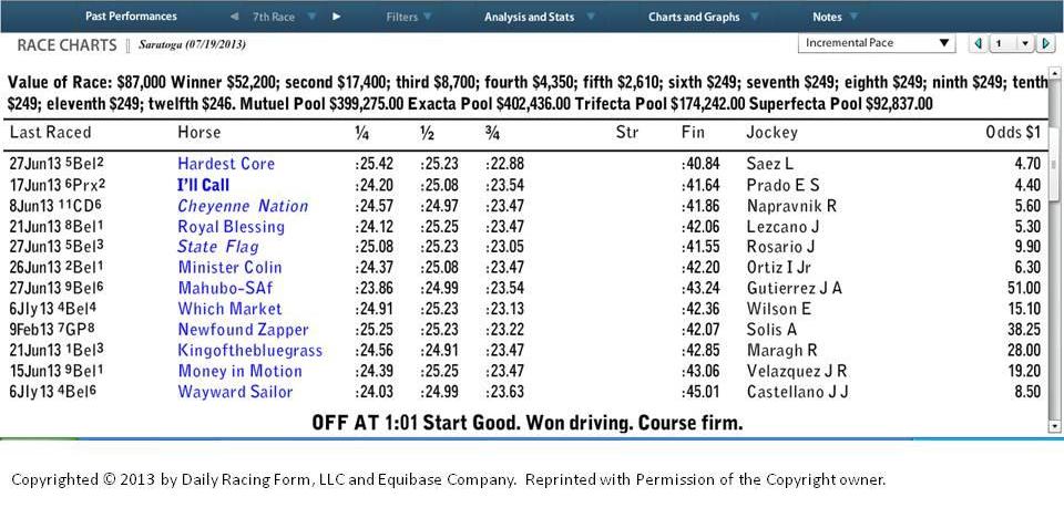
Both the “Next Race” and “Beyer Figures” options provide a good measure of the level of competition faced by the horse under review. But, what if you want more information about how this particular race (July 19 in this case) was run? There are two Result Chart options that provide time details for the race. The first is called “Incremental Pace” and the July 19 race appears below:
This chart breaks down the race into incremental pieces, with times run for each horse. In this race the first three columns represent how fast each horse ran for each quarter mile (2 furlongs). The last column is the time for the final 3 1/2 furlongs.
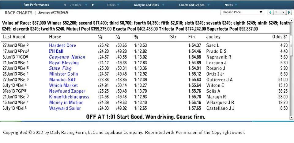
A different view, called “Elapsed Time“, shows you the time for each horse in the race at specific points. In this example, you see the time for 1/4 mile, 1/2 mile, 3/4 mile, and 1 3/16 miles. These points vary by the distance of the race being reviewed.
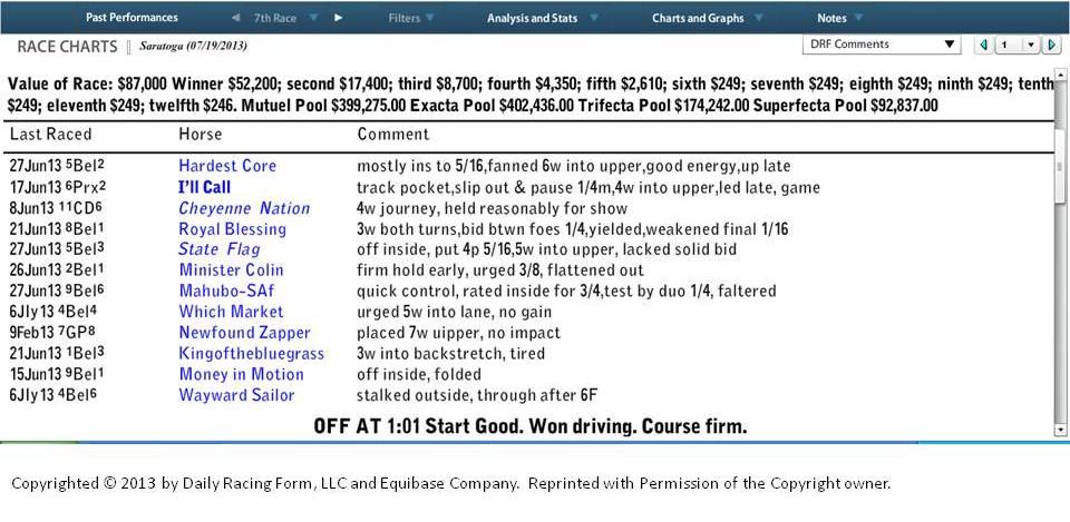
The last Result Chart view we’re going to review is called the “DRF Comments” view. It shows “extended” comments (trip notes) for each horse in the race. Click here to read a prior article explaining the terminology used in “trip notes.”
This is a quick overview of the types of information that is available using the Daily Racing Form’s Formulator program. We will have articles in the future providing examples of how you might use this information in your handicapping process.
Also, in the near future we’ll be providing an article detailing the Result Chart capability in the TimeformUS program.
Announcement: Very soon we’ll be introducing a new feature called “Get A Leg Up” where we will be providing pre-race handicapping observations for upcoming races … and following the race, a recap of results and lessons learned. Follow us on Twitter, Facebook, or an E-mail subscription to make sure you don’t miss any of the action. All of these options are on the right panel.


4 comments on “More On Result Charts: Beyer Figures, Time, and Extended Comments”